Every website on the web serves a purpose be it convincing buyers to make purchases, to seek subscriptions, or to deliver some useful information. When that purpose is fulfilled it is said that the website is generating leads. But if the website doesn’t fulfill that purpose then probably it is not designed with a proper strategy to meet those objectives.
You might fail to generate enough leads for your business despite investing heavily in digital marketing service if your website lacks some important web design practices that are essential for lead generation websites.
What are those important web design practices that should be followed to create a lead-generating website?
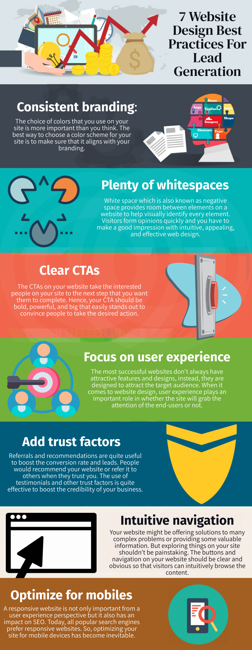
Let’s look at the 7 best web design best practices for developing lead-generating websites.

1. Consistent branding
The choice of colors that you use on your site is more important than you think. The best way to choose a color scheme for your site is to make sure that it aligns with your branding. You can refer to your logo and create a design with color schemes that blend perfectly with your brand image. According to research, colors can boost brand recognition by as much as 80%.
Apple’s website is a perfect example of how colors can be used for branding. Not the Apple logo alone but the whole website conveys the brand value of Apple: elegance, sleek design, and useful tools. The notable things on Apple website’s homepage are:
-
A distinctive logo that is easy to spot but not overwhelming.
-
Brief subheads and main heads that convey brand messages.
-
Beautiful and sleek products images.
These are the qualities that are associated with Apple’s products. So, this is how Apple’s website creates a brand image. Your website design strategies should cater to your branding. You can also utilize storytelling in web design to make your site more compelling.
Nowadays, the use of storytelling is becoming popular. You need to decide a story that you will want to tell your visitors and then incorporate it into your website design. By using a proper color scheme throughout your website, you can build consistent branding that could boost conversion rates.
2. Plenty of whitespaces
White space which is also known as negative space provides room between elements on a website to help visually identify every element. Visitors form opinions quickly and you have to make a good impression with intuitive, appealing, and effective web design. This is what you can achieve by leaving adequate whitespace between elements on your site. This whitespace or negative space allows elements to stand out from other elements forming a beautiful and eye-catching view.
Cluttered web design with no or too little space around elements will create chaos that would convince visitors to leave your site. You can use padding and margins to increase space between content, images, and other elements. Proper space between elements will make your webpage appealing and elegant. If your website doesn’t have proper spacing then this is the high time to opt for website redesign service.
3. Clear CTAs
The CTAs on your website take the interested people on your site to the next step that you want them to complete. Hence, your CTA should be bold, powerful, and big that easily stands out to convince people to take the desired action. Let’s take Netflix as an example to see the effectiveness of CTAs.

Things to note in the above image:
-
The webpage clearly shows what is being offered here – Unlimited movies, TV shows, etc. The message is clear and it sets that stage for the CTA placed below the message.
-
They’ve also addressed any potential action by the visitor that said watch anytime and cancel anytime.
-
Now there is a bold and colored CTA that is placed at a location where it’s easily visible. So the CTA is clear and obvious. Visitors can enter emails to get started for a free trial up to 30 days and that’s the lead for Netflix.
So this way you can spur the action of your visitors using CTAs and drive conversions.
4. Focus on user experience
The most successful websites don’t always have attractive features and designs, instead, they are designed to attract the target audience. When it comes to website design, user experience plays an important role in whether the site will grab the attention of the end-users or not. You have to focus on your target audience to create a website that would generate enough leads.
Identify your audience and design your website in a way to provide a greater user experience. Your website should not only have an attractive design but it should possess all the elements like easy navigation, clear typography, high-quality images, proper user flow for pages, etc that will offer an intuitive user experience.
5. Add trust factors
Referrals and recommendations are quite useful to boost the conversion rate and leads. People would recommend your website or refer it to others when they trust you. The use of testimonials and other trust factors is quite effective to boost the credibility of your business. To turn visitors into customers, you need to build trust among them and using trust factors on your site can be the best way to do this.
Adding testimonials, awards and recognitions, reviews, social media buttons, and other elements that tell about milestones you have reached and appreciations you received from clients will help build trust among your customers. You can showcase others’ experiences with your brand by integrating Google reviews and reviews from other popular sites like Yelp to present a good picture of your business in front of your customers.
6. Intuitive navigation
Your website might be offering solutions to many complex problems or providing some valuable information. But exploring things on your site shouldn’t be painstaking. The buttons and navigation on your website should be clear and obvious so that visitors can intuitively browse the content. Here are some points to make site navigation intuitive and clear:
-
Customize navigation as per content on your site. You may need fewer navigation links if there is limited content on your site. Similarly, you may need detailed navigation when you’ve heavier content on your site.
-
Use Breadcrumbs to let visitors easily find where they are at any point in navigation. Breadcrumbs track and display the current webpage or location on your site for a visitor as he/she browses through the site. It improves navigation and overall user experience that may help boost conversion.
-
Use easy and clear language for navigation links. You should use simple and recognizable terms such as ‘About’, ‘Contact’, ‘Services’, etc for navigation options instead of using more unique terms. If your unique language is too off track to confuse visitors, you must avoid it. Use terms that fit your navigation context.
You can use tools like heatmaps to understand user behavior then design the navigation based on that information. You can perform continuous A/B testing with a custom website design to pick the right design for your site.
7. Optimize for mobiles
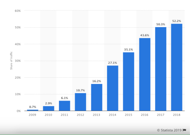
Mobile devices are becoming the new norm for exploring the web with the increasing use of mobiles for browsing the internet as shown in the trend by Statista below.

As is clear from the above stats over half of the webpages were served to mobile devices. It shows the potential of mobile devices, so optimizing your website for small screen devices would help you to reach a larger audience. A responsive website is not only important from a user experience perspective but it also has an impact on SEO. Today, all popular search engines prefer responsive websites. So, optimizing your site for mobile devices has become inevitable.
Wrapping up
It would be an understatement to say that web design is important for a website, in fact, your web design choice will have an impact on whether your site will be successful or not. If you want a website that will attract visitors while also generating leads and conversions, then your first step should be to start with better website design.
Although there is a lot of information in this blog, the key takeaway is to build a website that will have all the essential elements. So, you just don’t want to create a site and leave, you will generate revenue and grow your business.
No matter if you hire a web developer or choose a website designing company, you will always want to make sure that you get the best website for your business that brings leads and conversions. You can rely on Sparx IT Solutions to get the best website for your business.
We have proficient and experienced web designers who can build conversion-based websites. Our web designers are appraised of the latest web design practices that they utilize to create excellent websites for clients.


Comments
No Comments have been posted yet. Please feel free to comment first!Note: Make sure your comment is related to the topic of the article above. Let's start a personal and meaningful conversation!