The 2010s was the era of roller coaster ride for app developers and users. With the constant advancements in technology, the UX/UI design of mobile apps has witnessed a considerable change. In fact, it has gone to another level completely and marked this decade as a period of app design evolution.
The advanced designs of mobile apps have resulted in the huge growth of users. Have a look at a few examples that depict the positive impact of the app design evolution between 2010 and 2020 on the user base of apps:
- Twitter Users increased from 50 million in 2010 to 330 million in 2019
- Whatsapp Users increased from 465 million in 2014 to 2000 million in 2020
- Netflix Users increased from 21 million in 2011 to 182 million in 2020
The primary reasons behind this evolution and its impact are the increasing demand of customers and rising competition among businesses. These factors have contributed to the continual growth of mobile app market revenues.
From 97.7 billion U.S dollars in 2014, the revenue of the global mobile app market is expected to surpass 935 billion U.S dollars by 2023. The leap is huge not only in monetary terms but also in terms of user experience and interaction.
Do you know what is the powerful weapon of app developers for enhancing an app’s performance? It is the UX/UI design. The mobile app designers have come up with amazing innovations after vigorous experiments in the app designs.
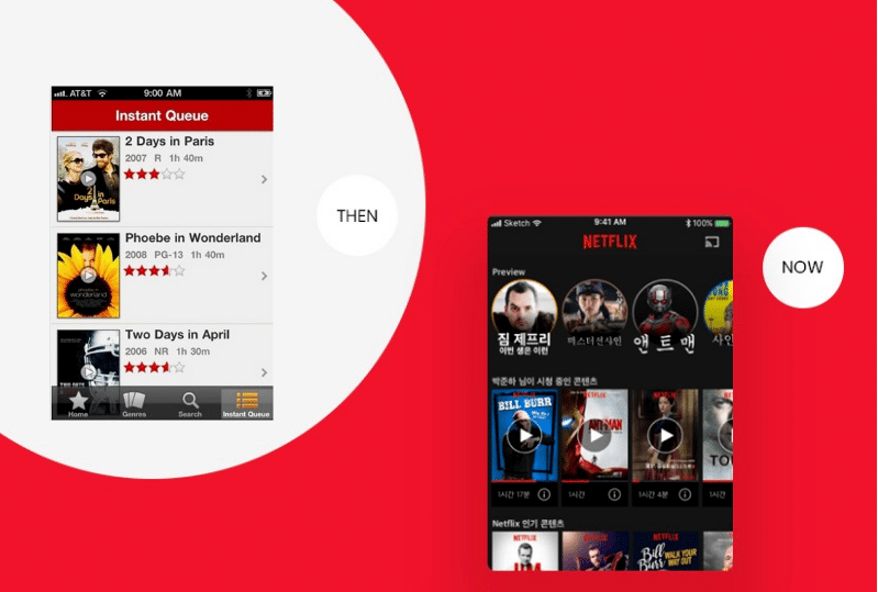
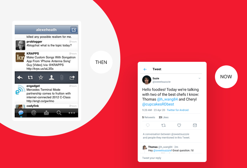
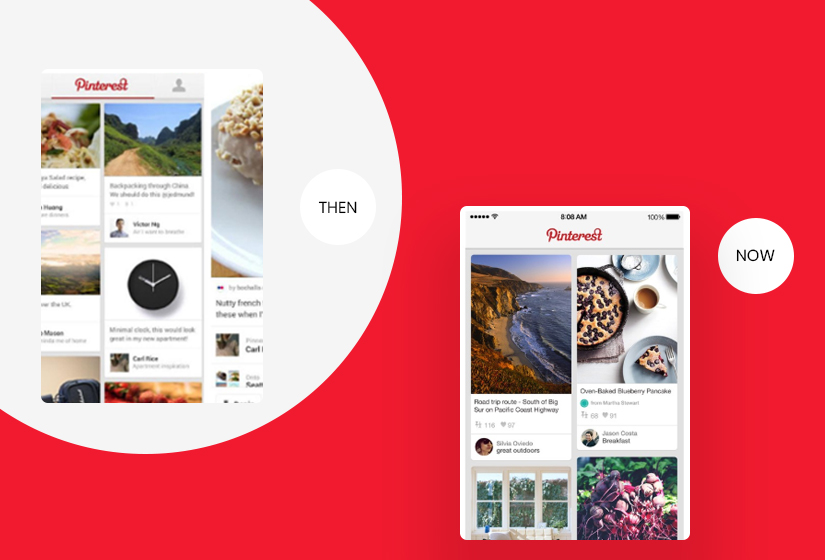
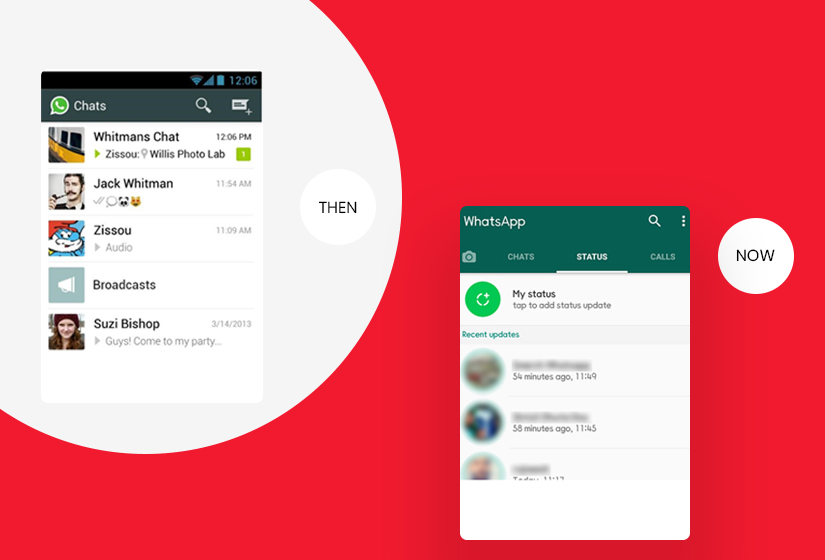
Let’s go back to the memory lane and recall the designs of our favorite apps. The decade of 2010-20 is marked with significant changes in the mobile app designs. Here are the images that show how your favorite app looked in 2010 and how it looks now in 2020.
Check Out “THEN and NOW” Looks of Your Favorite Apps: 2010 vs 2020
- NETFLIX
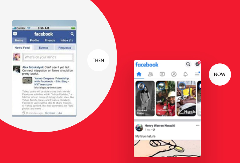
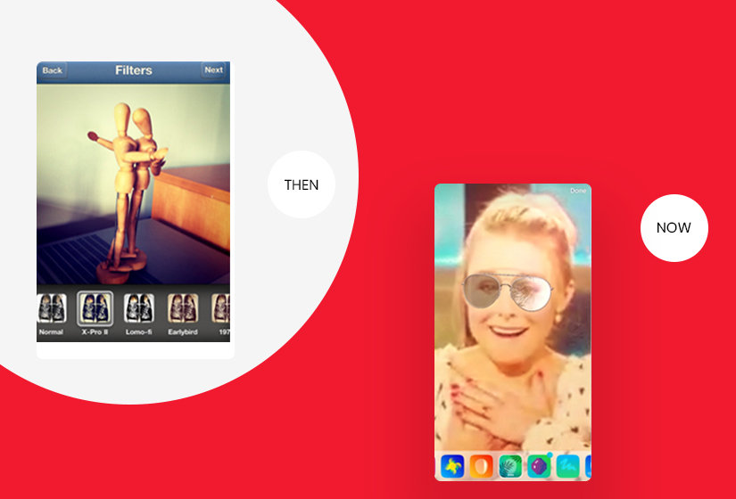
After checking the “Then and Now” looks of your favorite apps, let us explore what made them change so much. Here are the trends that lead to these changes in mobile app designs between 2010 and 2020:
What did We observe?
Illustrations Have Taken Over Space:
As you can see in these app designs, the use of more illustrations is evident. From Netflix to the TED app, the screen has been filled with illustrations over texts. Eye-catching palettes are a significant part of new designs.
These illustrations have become more than a mere photograph. This is a way to attract users’ attention and increase their interactivity. No one likes to be bombarded with text when they open an app, hence using illustrations enhances user interactivity.
More Transparent Elements:
The transparent and semi-transparent elements are completely new to our screen. It utilizes the space which is limited in mobile phones efficiently. The color of gradients has a great impact on users’ minds and acts as a curtain instead of a barrier.
The transparent elements allow users to see the background of the app. It seems to be lightweight and connects users. It feels as if you can touch the backdrop and it is not far away from you. This sensation of connectivity is what exactly designers are striving to achieve.
Rounded Shapes
If you want to give your design an organic look then start using rounded shapes. Over the decade, the designers have started using organic shapes. It makes the environment interactive and less technical.
It adds fun even in finance apps. The rounded edges have been used extensively to take away the feels of a formal setting where stress and burden are the only vibes. The organic design with imperfect and imbalance shapes are serving the purpose of businesses in stimulating positive emotions in users.
AR/VR
The mixed reality has become a focal point in modern designs. The filters in social networking apps like Instagram have started providing an interactive experience. It enhances the real-world elements by using augmented reality.
In contemporary times, the eCommerce apps have also started offering real after-purchase feels through mixed reality. These advancements in app designing have made apps more reliable and fun to use.
Dark Mode:
In comparison to the apps in 2010, more apps have started using a dark background. Although there are apps that have stayed true with their all-white backgrounds most of them have shifted towards the dark mode.
White background strains your eyes more. If not completely dark, the use of more colors in apps has also served the same purpose. It provides greater comfort to users and allows them to use these apps for long hours without straining their eyes.
Are You a Part of This App Design Evolution?
We are all a part of this app design evolution as users and enjoy the comfort we have been provided by app designers over the decade. Users expect more convenience and comfort with every next app that they start to use. This burdens the entrepreneurs in providing high-end mobile apps.
If this bothers you too then get ready to be the driver of this evolution. Anything less than the latest trends and innovative design in mobile apps is being rejected by customers without giving a single thought. You need someone who can redesign your app according to the latest trends.
UX/UI designers at Sparx IT Solutions understands this app design evolution in depth. Being the leading providers of UX/UI design services from the past 12 years, we have paved the successful journeys for various mobile applications. You can contact us to redesign your app and give a boost to user acquisition and retention rates.


